LET'S BUILD MEANINGFUL DIGITAL EXPERIENCES TOGETHER.
LET'S BUILD MEANINGFUL DIGITAL EXPERIENCES TOGETHER.
Prioritized clarity over density by organizing information into structured, easy-to-scan sections.
Prioritized clarity over density by organizing information into structured, easy-to-scan sections.
Prioritized clarity over density by organizing information into structured, easy-to-scan sections.
Design Decision
Design Decision
Design Decision
Challenge
Challenge
Challenge
One of the main challenges was simplifying a complex system without removing essential information needed for decision-making.
One of the main challenges was simplifying a complex system without removing essential information needed for decision-making.
One of the main challenges was simplifying a complex system without removing essential information needed for decision-making.
Transportation Experience App
Transportation Experience App
Transportation Experience App
📱 Role: UX/UI Designer.
⌚ Duration: 3–4 months.
🛠️ Tools: Figma.
📱 Role: UX/UI Designer.
⌚ Duration: 3–4 months.
🛠️ Tools: Figma.
📱 Role: UX/UI Designer.
⌚ Duration: 3–4 months.
🛠️ Tools: Figma.
Users often feel confused and overwhelmed when navigating transportation systems due to complex routes, unclear information, and too many decision points.
Users often feel confused and overwhelmed when navigating transportation systems due to complex routes, unclear information, and too many decision points.
Users often feel confused and overwhelmed when navigating transportation systems due to complex routes, unclear information, and too many decision points.
The problem
The problem
The problem
Design a simple and intuitive digital experience that helps users understand routes, make decisions faster, and navigate transportation systems with confidence.
Design a simple and intuitive digital experience that helps users understand routes, make decisions faster, and navigate transportation systems with confidence.
Design a simple and intuitive digital experience that helps users understand routes, make decisions faster, and navigate transportation systems with confidence.
The goal
The goal
The goal
Through research and observation, I identified that users:
Struggle to understand route options quickly.
Feel stressed when making time-sensitive decisions.
Need clear and structured information.
Prefer simple, guided experiences over complex interfaces.
Through research and observation, I identified that users:
Struggle to understand route options quickly.
Feel stressed when making time-sensitive decisions.
Need clear and structured information.
Prefer simple, guided experiences over complex interfaces.
Through research and observation, I identified that users:
Struggle to understand route options quickly.
Feel stressed when making time-sensitive decisions.
Need clear and structured information.
Prefer simple, guided experiences over complex interfaces.
Understanding the user
Understanding the user
Understanding the user
Users don’t just need directions — they need clarity and confidence when making decisions in time-sensitive situations.
Users don’t just need directions — they need clarity and confidence when making decisions in time-sensitive situations.
Users don’t just need directions — they need clarity and confidence when making decisions in time-sensitive situations.
Analyzed user behavior and pain points:
Defined user flows focused on clarity and speed.
Created wireframes to simplify navigation.
Designed clean and structured UI.
Iterated based on usability feedback.
Analyzed user behavior and pain points:
Defined user flows focused on clarity and speed.
Created wireframes to simplify navigation.
Designed clean and structured UI.
Iterated based on usability feedback.
Analyzed user behavior and pain points:
Defined user flows focused on clarity and speed.
Created wireframes to simplify navigation.
Designed clean and structured UI.
Iterated based on usability feedback.
Design process
Design process
Design process
Key insight
Key insight
Key insight
The solution improves user clarity, reduces confusion during navigation, and enables faster and more confident decision-making in transportation systems.
The solution improves user clarity, reduces confusion during navigation, and enables faster and more confident decision-making in transportation systems.
The solution improves user clarity, reduces confusion during navigation, and enables faster and more confident decision-making in transportation systems.
Impact
Impact
Impact
Solution
Solution
Solution
Designed a transportation app that:
Simplifies route selection.
Presents information in a clear and structured way.
Reduces cognitive load during decision-making.
Helps users move through the system with confidence.
Designed a transportation app that:
Simplifies route selection.
Presents information in a clear and structured way.
Reduces cognitive load during decision-making.
Helps users move through the system with confidence.
Designed a transportation app that:
Simplifies route selection.
Presents information in a clear and structured way.
Reduces cognitive load during decision-making.
Helps users move through the system with confidence.
Learnings
Learnings
Learnings
Through this project, I learned:
The importance of designing for speed and clarity in high-pressure situations.
How to simplify complex systems into intuitive flows.
The value of reducing cognitive load in user interfaces.
Through this project, I learned:
The importance of designing for speed and clarity in high-pressure situations.
How to simplify complex systems into intuitive flows.
The value of reducing cognitive load in user interfaces.
Through this project, I learned:
The importance of designing for speed and clarity in high-pressure situations.
How to simplify complex systems into intuitive flows.
The value of reducing cognitive load in user interfaces.
Home /Search Screen: Allows users to quickly input destinations and access routes with minimal effort.
Home /Search Screen: Allows users to quickly input destinations and access routes with minimal effort.
Home /Search Screen: Allows users to quickly input destinations and access routes with minimal effort.




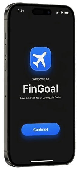
FinGoal – Collaborative Savings App
FinGoal – Collaborative Savings App
FinGoal – Collaborative Savings App
MY WORK
MY WORK
MY WORK
Add Contribution Screen: Simplifies the process of adding money, reducing friction in user actions.
📱 Role: UX/UI Designer.
⌚ Duration: 5 months.
🛠️ Tools: Figma.
📱 Role: UX/UI Designer.
⌚ Duration: 5 months.
🛠️ Tools: Figma.
📱 Role: UX/UI Designer.
⌚ Duration: 5 months.
🛠️ Tools: Figma.
Users struggle to manage shared savings due to lack of transparency and difficulty tracking contributions across different people.
Users struggle to manage shared savings due to lack of transparency and difficulty tracking contributions across different people.
Users struggle to manage shared savings due to lack of transparency and difficulty tracking contributions across different people.




The problem
The problem
The problem
Design a simple and intuitive experience that allows users to create savings goals, track progress, and collaborate with others seamlessly.
Design a simple and intuitive experience that allows users to create savings goals, track progress, and collaborate with others seamlessly.
Design a simple and intuitive experience that allows users to create savings goals, track progress, and collaborate with others seamlessly.

Designed a mobile app that allows users to:
Create personal or shared goals.
Track progress visually.
Add contributions easily.
Collaborate with friends or family.
Impact
3 of 5 users completed the onboarding flow without assistance after the redesign
Learnings
Designed a mobile app that allows users to:
Create personal or shared goals.
Track progress visually.
Add contributions easily.
Collaborate with friends or family.
Impact
3 of 5 users completed the onboarding flow without assistance after the redesign
Learnings
The goal
The goal
The goal
Through research, I identified that users:
Feel confused about shared vs personal contributions.
Need visibility and control over their savings.
Want a simple and stress-free experience.
Through research, I identified that users:
Feel confused about shared vs personal contributions.
Need visibility and control over their savings.
Want a simple and stress-free experience.
Through research, I identified that users:
Feel confused about shared vs personal contributions.
Need visibility and control over their savings.
Want a simple and stress-free experience.
Understanding the user
Understanding the user
Users don’t just need to track money — they need clarity, trust, and motivation when saving with others.
Users don’t just need to track money — they need clarity, trust, and motivation when saving with others.
Users don’t just need to track money — they need clarity, trust, and motivation when saving with others.
Key insight
Key insight
Key insight
Design process
Design process
Design process
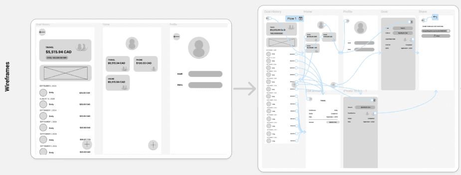
Defined user flows and structure:
Created wireframes to explore solutions.
Designed intuitive interfaces focused on clarity.
Tested and refined based on usability feedback.
Defined user flows and structure:
Created wireframes to explore solutions.
Designed intuitive interfaces focused on clarity.
Tested and refined based on usability feedback.
Defined user flows and structure:
Created wireframes to explore solutions.
Designed intuitive interfaces focused on clarity.
Tested and refined based on usability feedback.
Solution
Solution
Solution
Through this project, I learned the importance of:
Designing for clarity in collaborative experiences.
Simplifying complex flows.
Iterating based on user feedback.
Through this project, I learned the importance of:
Designing for clarity in collaborative experiences.
Simplifying complex flows.
Iterating based on user feedback.
Through this project, I learned the importance of:
Designing for clarity in collaborative experiences.
Simplifying complex flows.
Iterating based on user feedback.
Add Contribution Screen: Simplifies the process of adding money, reducing friction in user actions.
Add Contribution Screen: Simplifies the process of adding money, reducing friction in user actions.
Home Screen: Provides a clear overview of all goals and overall progress to help users stay motivated.
Home Screen: Provides a clear overview of all goals and overall progress to help users stay motivated.
Home Screen: Provides a clear overview of all goals and overall progress to help users stay motivated.